In [1]: import matplotlib as mpl

#mpl.rcParams['legend.fontsize']=20.0
#print mpl.matplotlib_fname() # location of the rc file
#print mpl.rcParams # current config
In [2]: print mpl.get_backend()
Qt5Agg
8.1 Basic Plotting: plot
See the cookbook for some advanced strategies
The plot method on Series and DataFrame is just a simple wrapper around
plt.plot():
In [3]: ts = pd.Series(np.random.randn(1000), index=pd.date_range('1/1/2000', periods=1000))

In [4]: ts = ts.cumsum()

In [5]: ts.plot()
Out[5]: <matplotlib.axes._subplots.AxesSubplot at 0x2b35acda7ed0>
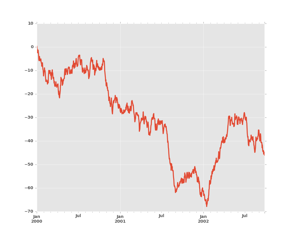
If the index consists of dates, it calls gcf().autofmt_xdate()
to try to format the x-axis nicely as per above.
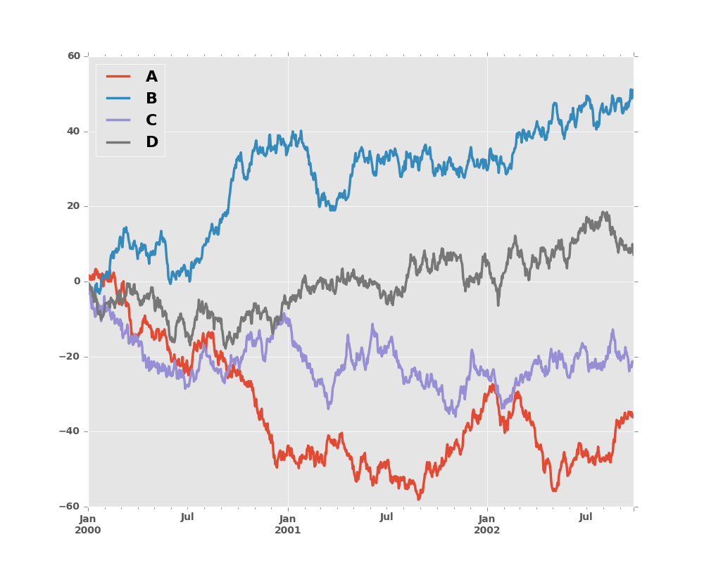
On DataFrame, plot() is a convenience to plot all of the columns with labels:
In [6]: df = pd.DataFrame(np.random.randn(1000, 4), index=ts.index, columns=list('ABCD'))

In [7]: df = df.cumsum()

In [8]: plt.figure(); df.plot();
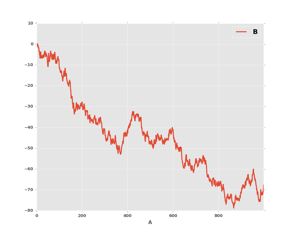
You can plot one column versus another using the x and y keywords in
plot():
In [9]: df3 = pd.DataFrame(np.random.randn(1000, 2), columns=['B', 'C']).cumsum()

In [10]: df3['A'] = pd.Series(list(range(len(df))))

In [11]: df3.plot(x='A', y='B')
Out[11]: <matplotlib.axes._subplots.AxesSubplot at 0x2b35acc7fb50>
Note
For more formatting and styling options, see below.