In [1]: import matplotlib as mpl

#mpl.rcParams['legend.fontsize']=20.0
#print mpl.matplotlib_fname() # location of the rc file
#print mpl.rcParams # current config
In [2]: print mpl.get_backend()
Qt5Agg

In [3]: ts = pd.Series(np.random.randn(1000), index=pd.date_range('1/1/2000', periods=1000))

In [4]: ts = ts.cumsum()

In [5]: from pandas.tools.plotting import parallel_coordinates

In [6]: from pandas.tools.plotting import andrews_curves

In [7]: url = 'https://raw.githubusercontent.com/pydata/pandas/master/doc/data/iris.data'

In [8]: data = pd.read_csv(url)
8.5 Plot Formatting
Most plotting methods have a set of keyword arguments that control the layout and formatting of the returned plot:
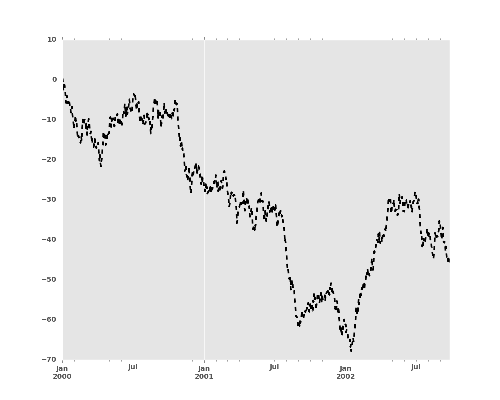
In [9]: plt.figure(); ts.plot(style='k--', label='Series');
For each kind of plot (e.g. line, bar, scatter) any additional arguments
keywords are passed along to the corresponding matplotlib function
(ax.plot(),
ax.bar(),
ax.scatter()). These can be used
to control additional styling, beyond what pandas provides.
8.5.1 Controlling the Legend
You may set the legend argument to False to hide the legend, which is
shown by default.
In [10]: df = pd.DataFrame(np.random.randn(1000, 4), index=ts.index, columns=list('ABCD'))

In [11]: df = df.cumsum()

In [12]: df.plot(legend=False)
Out[12]: <matplotlib.axes._subplots.AxesSubplot at 0x2b35bef5b350>
8.5.2 Scales
You may pass logy to get a log-scale Y axis.
In [13]: ts = pd.Series(np.random.randn(1000), index=pd.date_range('1/1/2000', periods=1000))

In [14]: ts = np.exp(ts.cumsum())

In [15]: ts.plot(logy=True)
Out[15]: <matplotlib.axes._subplots.AxesSubplot at 0x2b35bf0c8bd0>
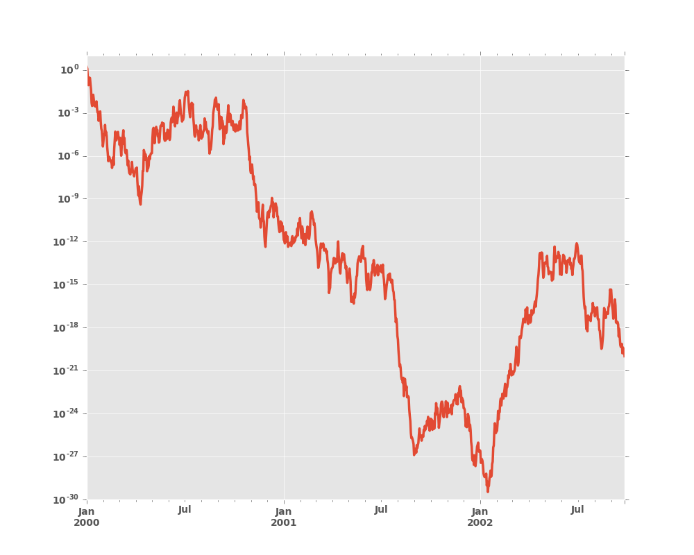
See also the logx and loglog keyword arguments.
8.5.3 Plotting on a Secondary Y-axis
To plot data on a secondary y-axis, use the secondary_y keyword:
In [16]: df.A.plot()
Out[16]: <matplotlib.axes._subplots.AxesSubplot at 0x2b35bf1d1490>

In [17]: df.B.plot(secondary_y=True, style='g')
Out[17]: <matplotlib.axes._subplots.AxesSubplot at 0x2b35be1462d0>
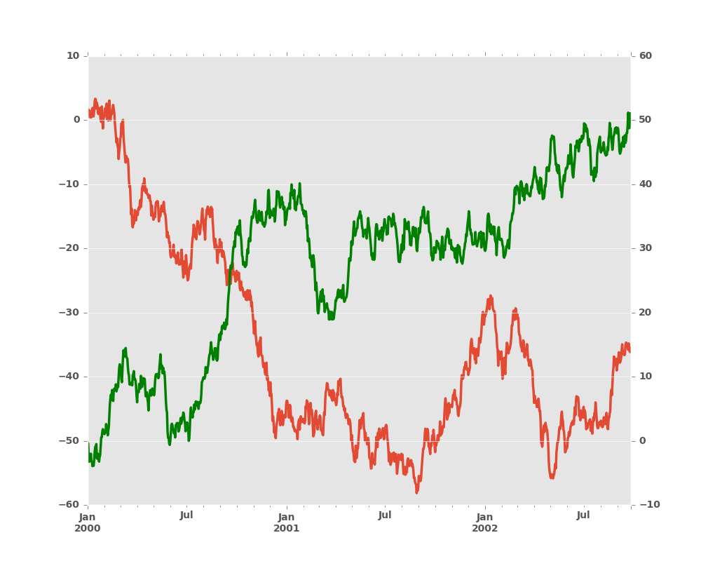
To plot some columns in a DataFrame, give the column names to the secondary_y
keyword:
In [18]: plt.figure()
Out[18]: <matplotlib.figure.Figure at 0x2b35acee8210>

In [19]: ax = df.plot(secondary_y=['A', 'B'])

In [20]: ax.set_ylabel('CD scale')
Out[20]: <matplotlib.text.Text at 0x2b35b9bb2c50>

In [21]: ax.right_ax.set_ylabel('AB scale')
Out[21]: <matplotlib.text.Text at 0x2b358cdb3110>
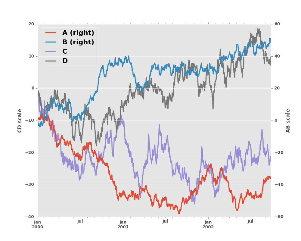
Note that the columns plotted on the secondary y-axis is automatically marked
with “(right)” in the legend. To turn off the automatic marking, use the
mark_right=False keyword:
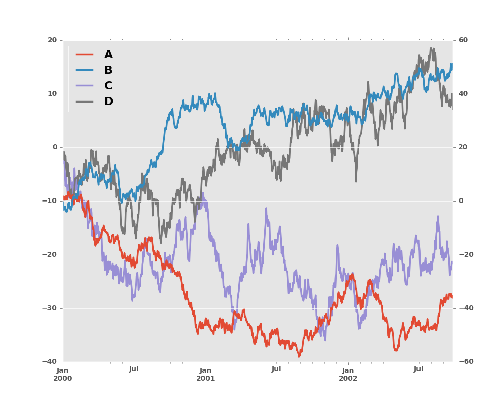
In [22]: plt.figure()
Out[22]: <matplotlib.figure.Figure at 0x2b35bc53a5d0>

In [23]: df.plot(secondary_y=['A', 'B'], mark_right=False)
Out[23]: <matplotlib.axes._subplots.AxesSubplot at 0x2b35bc531350>
8.5.4 Suppressing Tick Resolution Adjustment
pandas includes automatic tick resolution adjustment for regular frequency
time-series data. For limited cases where pandas cannot infer the frequency
information (e.g., in an externally created twinx), you can choose to
suppress this behavior for alignment purposes.
Here is the default behavior, notice how the x-axis tick labelling is performed:
In [24]: plt.figure()
Out[24]: <matplotlib.figure.Figure at 0x2b35b9ceea90>
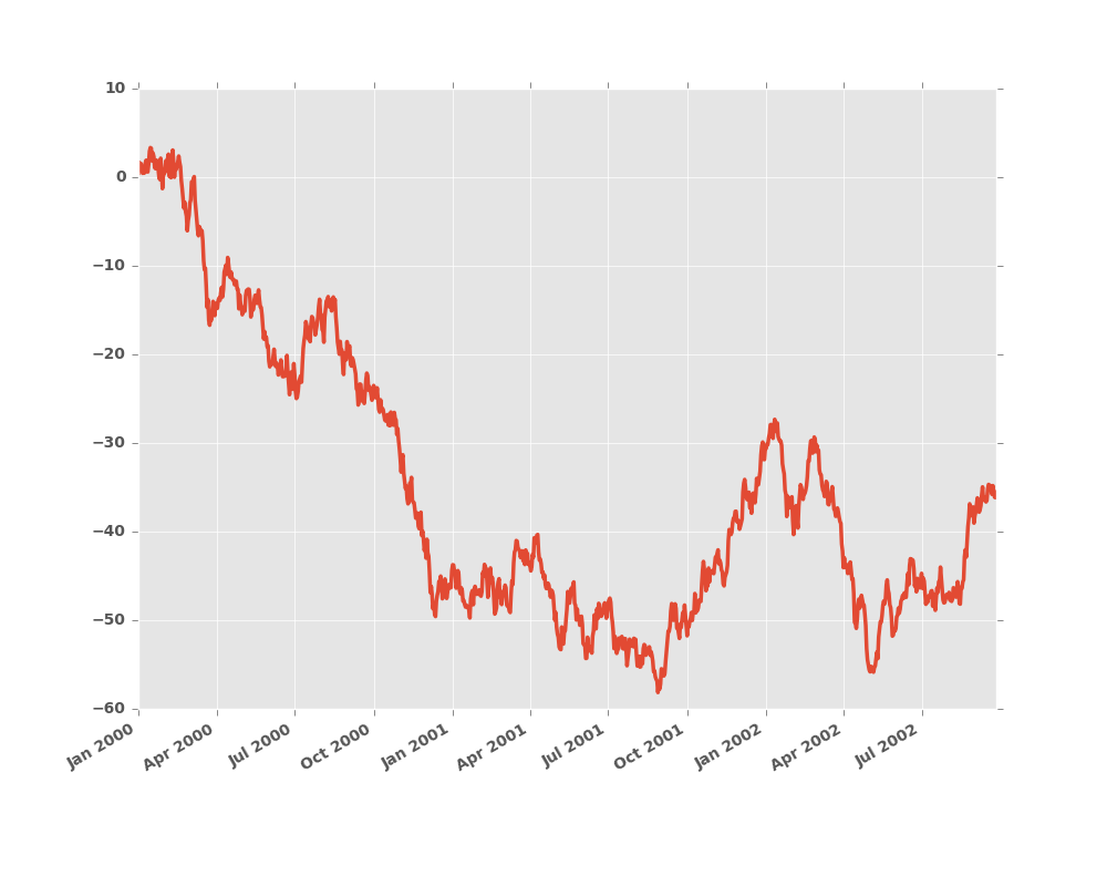
In [25]: df.A.plot()
Out[25]: <matplotlib.axes._subplots.AxesSubplot at 0x2b35b9cee7d0>
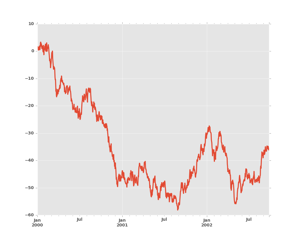
Using the x_compat parameter, you can suppress this behavior:
In [26]: plt.figure()
Out[26]: <matplotlib.figure.Figure at 0x2b35bee3d710>

In [27]: df.A.plot(x_compat=True)
Out[27]: <matplotlib.axes._subplots.AxesSubplot at 0x2b35beeaa250>
If you have more than one plot that needs to be suppressed, the use method
in pandas.plot_params can be used in a with statement:
In [28]: plt.figure()
Out[28]: <matplotlib.figure.Figure at 0x2b35bc5c7590>
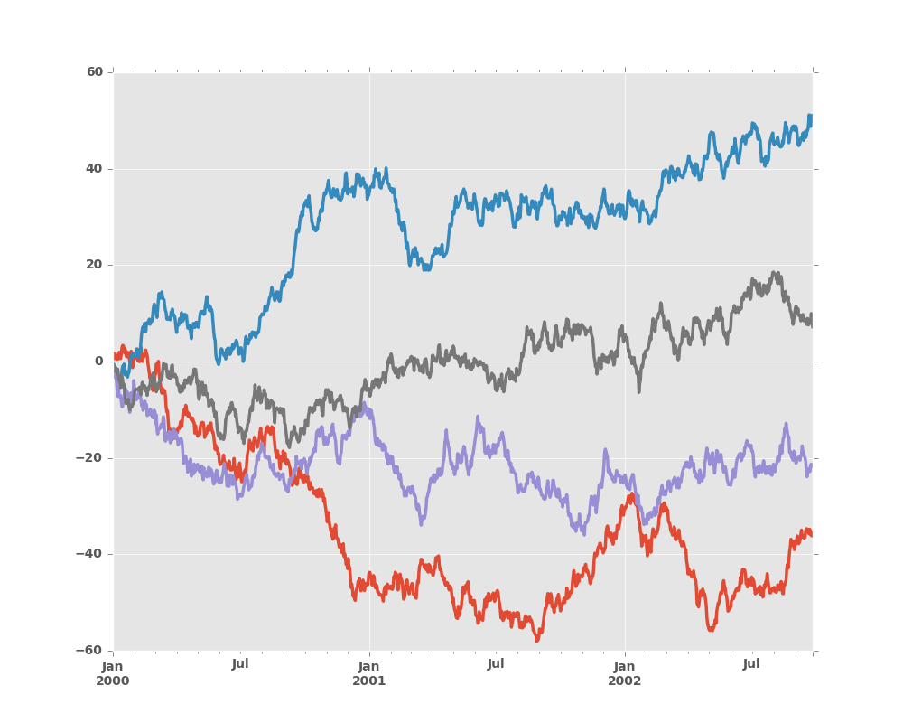
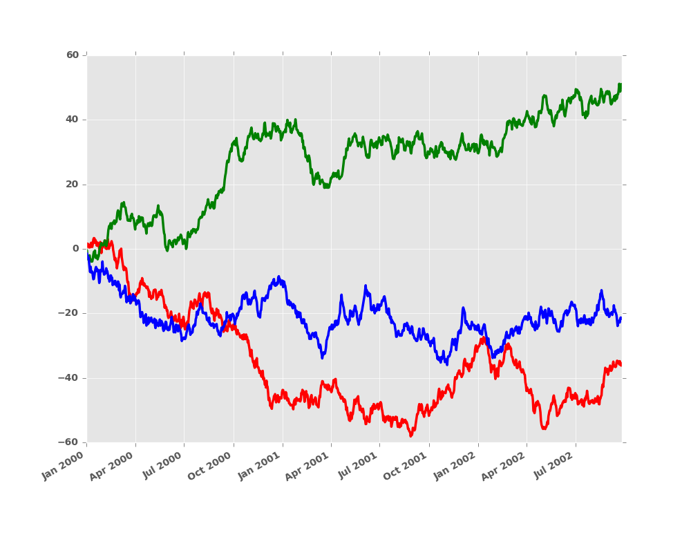
In [29]: with pd.plot_params.use('x_compat', True):
....: df.A.plot(color='r')
....: df.B.plot(color='g')
....: df.C.plot(color='b')
....:
8.5.5 Subplots
Each Series in a DataFrame can be plotted on a different axis
with the subplots keyword:
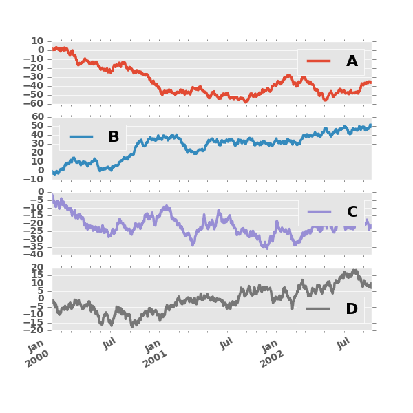
In [30]: df.plot(subplots=True, figsize=(6, 6));
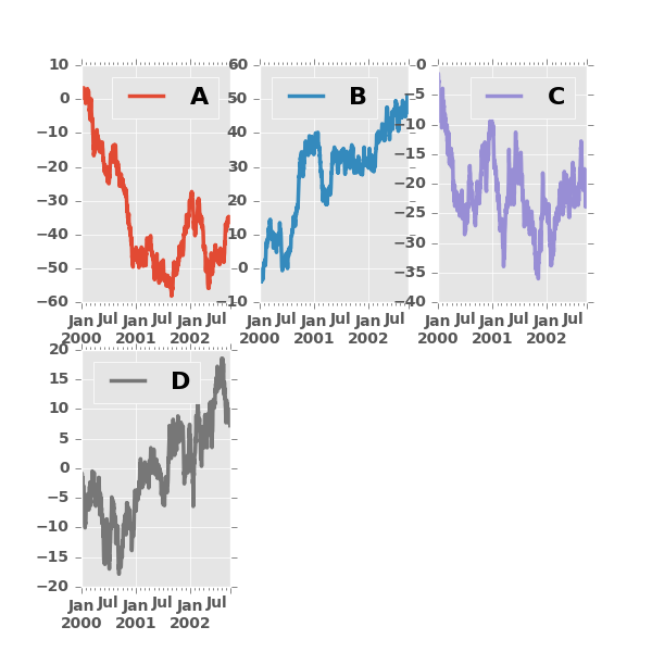
8.5.6 Using Layout and Targeting Multiple Axes
The layout of subplots can be specified by layout keyword. It can accept
(rows, columns). The layout keyword can be used in
hist and boxplot also. If input is invalid, ValueError will be raised.
The number of axes which can be contained by rows x columns specified by layout must be
larger than the number of required subplots. If layout can contain more axes than required,
blank axes are not drawn. Similar to a numpy array’s reshape method, you
can use -1 for one dimension to automatically calculate the number of rows
or columns needed, given the other.
In [31]: df.plot(subplots=True, layout=(2, 3), figsize=(6, 6), sharex=False);
The above example is identical to using
In [32]: df.plot(subplots=True, layout=(2, -1), figsize=(6, 6), sharex=False);
The required number of columns (3) is inferred from the number of series to plot and the given number of rows (2).
Also, you can pass multiple axes created beforehand as list-like via ax keyword.
This allows to use more complicated layout.
The passed axes must be the same number as the subplots being drawn.
When multiple axes are passed via ax keyword, layout, sharex and sharey keywords
don’t affect to the output. You should explicitly pass sharex=False and sharey=False,
otherwise you will see a warning.
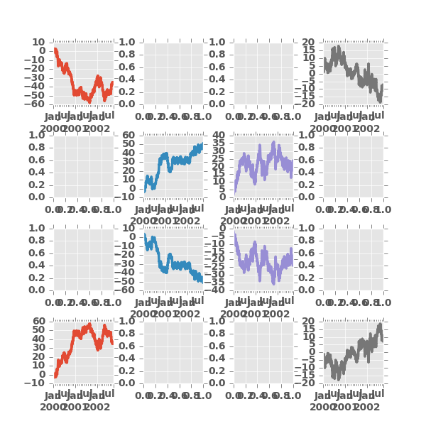
In [33]: fig, axes = plt.subplots(4, 4, figsize=(6, 6));

In [34]: plt.subplots_adjust(wspace=0.5, hspace=0.5);

In [35]: target1 = [axes[0][0], axes[1][1], axes[2][2], axes[3][3]]

In [36]: target2 = [axes[3][0], axes[2][1], axes[1][2], axes[0][3]]

In [37]: df.plot(subplots=True, ax=target1, legend=False, sharex=False, sharey=False);

In [38]: (-df).plot(subplots=True, ax=target2, legend=False, sharex=False, sharey=False);
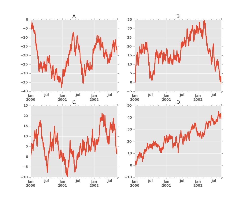
Another option is passing an ax argument to Series.plot() to plot on a particular axis:
In [39]: fig, axes = plt.subplots(nrows=2, ncols=2)

In [40]: df['A'].plot(ax=axes[0,0]); axes[0,0].set_title('A');

In [41]: df['B'].plot(ax=axes[0,1]); axes[0,1].set_title('B');

In [42]: df['C'].plot(ax=axes[1,0]); axes[1,0].set_title('C');

In [43]: df['D'].plot(ax=axes[1,1]); axes[1,1].set_title('D');
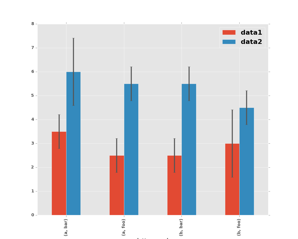
8.5.7 Plotting With Error Bars
New in version 0.14.
Plotting with error bars is now supported in the DataFrame.plot() and Series.plot()
Horizontal and vertical errorbars can be supplied to the xerr and yerr keyword arguments to plot(). The error values can be specified using a variety of formats.
- As a
DataFrameordictof errors with column names matching thecolumnsattribute of the plottingDataFrameor matching thenameattribute of theSeries - As a
strindicating which of the columns of plottingDataFramecontain the error values - As raw values (
list,tuple, ornp.ndarray). Must be the same length as the plottingDataFrame/Series
Asymmetrical error bars are also supported, however raw error values must be provided in this case. For a M length Series, a Mx2 array should be provided indicating lower and upper (or left and right) errors. For a MxN DataFrame, asymmetrical errors should be in a Mx2xN array.
Here is an example of one way to easily plot group means with standard deviations from the raw data.
# Generate the data
In [44]: ix3 = pd.MultiIndex.from_arrays([['a', 'a', 'a', 'a', 'b', 'b', 'b', 'b'], ['foo', 'foo', 'bar', 'bar', 'foo', 'foo', 'bar', 'bar']], names=['letter', 'word'])

In [45]: df3 = pd.DataFrame({'data1': [3, 2, 4, 3, 2, 4, 3, 2], 'data2': [6, 5, 7, 5, 4, 5, 6, 5]}, index=ix3)

# Group by index labels and take the means and standard deviations for each group
In [46]: gp3 = df3.groupby(level=('letter', 'word'))

In [47]: means = gp3.mean()

In [48]: errors = gp3.std()

In [49]: means
Out[49]:
             data1  data2
letter word
a      bar     3.5    6.0
       foo     2.5    5.5
b      bar     2.5    5.5
       foo     3.0    4.5

In [50]: errors
Out[50]:
                data1     data2
letter word
a      bar   0.707107  1.414214
       foo   0.707107  0.707107
b      bar   0.707107  0.707107
       foo   1.414214  0.707107

# Plot
In [51]: fig, ax = plt.subplots()

In [52]: means.plot.bar(yerr=errors, ax=ax)
Out[52]: <matplotlib.axes._subplots.AxesSubplot at 0x2b35bfbc6750>
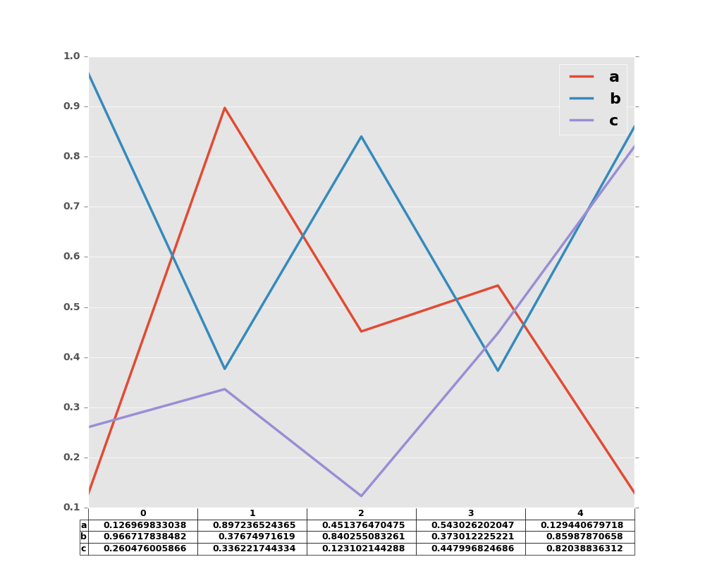
8.5.8 Plotting Tables
New in version 0.14.
Plotting with matplotlib table is now supported in DataFrame.plot() and Series.plot() with a table keyword. The table keyword can accept bool, DataFrame or Series. The simple way to draw a table is to specify table=True. Data will be transposed to meet matplotlib’s default layout.
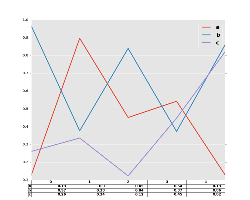
In [53]: fig, ax = plt.subplots(1, 1)

In [54]: df = pd.DataFrame(np.random.rand(5, 3), columns=['a', 'b', 'c'])

In [55]: ax.get_xaxis().set_visible(False)   # Hide Ticks

In [56]: df.plot(table=True, ax=ax)
Out[56]: <matplotlib.axes._subplots.AxesSubplot at 0x2b35bc02c0d0>
Also, you can pass different DataFrame or Series for table keyword. The data will be drawn as displayed in print method (not transposed automatically). If required, it should be transposed manually as below example.
In [57]: fig, ax = plt.subplots(1, 1)

In [58]: ax.get_xaxis().set_visible(False)   # Hide Ticks

In [59]: df.plot(table=np.round(df.T, 2), ax=ax)
Out[59]: <matplotlib.axes._subplots.AxesSubplot at 0x2b35bbb0b4d0>
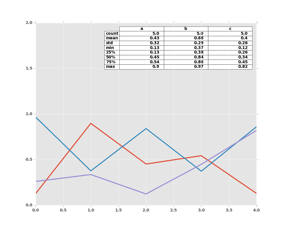
Finally, there is a helper function pandas.tools.plotting.table to create a table from DataFrame and Series, and add it to an matplotlib.Axes. This function can accept keywords which matplotlib table has.
In [60]: from pandas.tools.plotting import table

In [61]: fig, ax = plt.subplots(1, 1)

In [62]: table(ax, np.round(df.describe(), 2),
   ....:       loc='upper right', colWidths=[0.2, 0.2, 0.2])
   ....:
Out[62]: <matplotlib.table.Table at 0x2b35e0050e90>

In [63]: df.plot(ax=ax, ylim=(0, 2), legend=None)
Out[63]: <matplotlib.axes._subplots.AxesSubplot at 0x2b35bba34850>
Note: You can get table instances on the axes using axes.tables property for further decorations. See the matplotlib table documentation for more.
8.5.9 Colormaps
A potential issue when plotting a large number of columns is that it can be
difficult to distinguish some series due to repetition in the default colors. To
remedy this, DataFrame plotting supports the use of the colormap= argument,
which accepts either a Matplotlib colormap
or a string that is a name of a colormap registered with Matplotlib. A
visualization of the default matplotlib colormaps is available here.
As matplotlib does not directly support colormaps for line-based plots, the colors are selected based on an even spacing determined by the number of columns in the DataFrame. There is no consideration made for background color, so some colormaps will produce lines that are not easily visible.
To use the cubehelix colormap, we can simply pass 'cubehelix' to colormap=
In [64]: df = pd.DataFrame(np.random.randn(1000, 10), index=ts.index)

In [65]: df = df.cumsum()

In [66]: plt.figure()
Out[66]: <matplotlib.figure.Figure at 0x2b35bf930f10>

In [67]: df.plot(colormap='cubehelix')
Out[67]: <matplotlib.axes._subplots.AxesSubplot at 0x2b35bf95ee50>
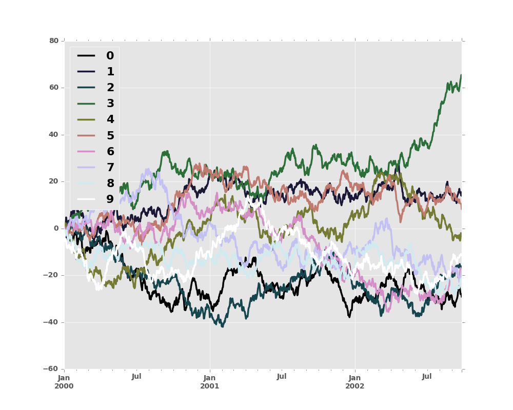
or we can pass the colormap itself
In [68]: from matplotlib import cm

In [69]: plt.figure()
Out[69]: <matplotlib.figure.Figure at 0x2b35e000c110>

In [70]: df.plot(colormap=cm.cubehelix)
Out[70]: <matplotlib.axes._subplots.AxesSubplot at 0x2b35be3f3590>

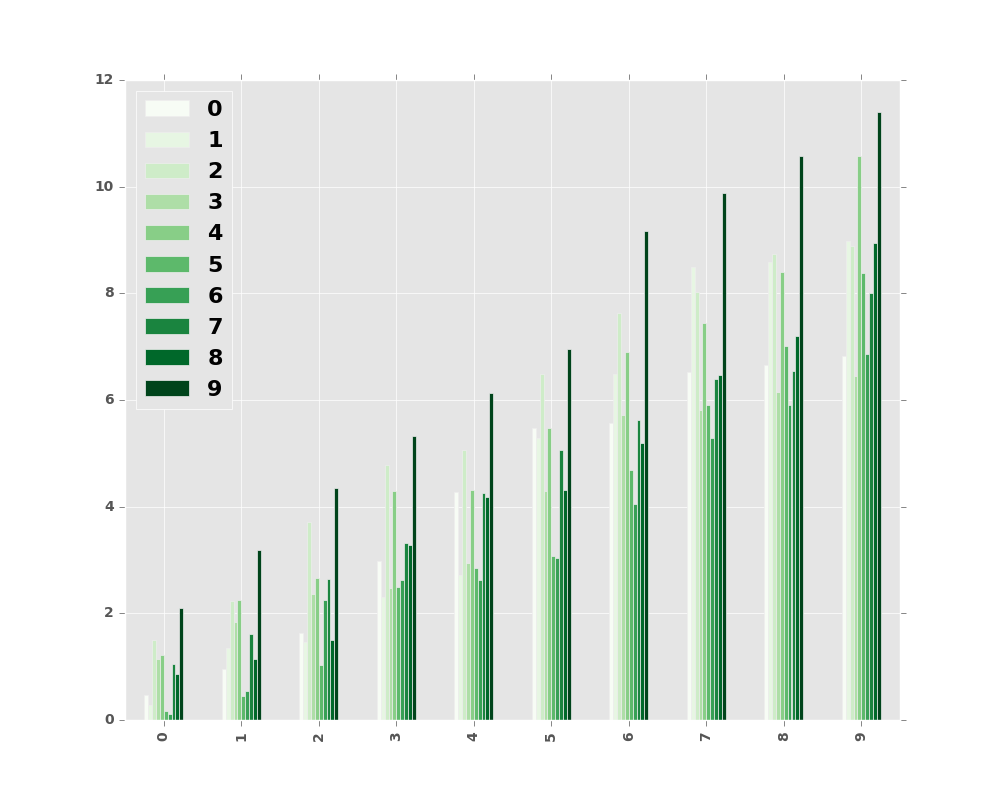
Colormaps can also be used other plot types, like bar charts:
In [71]: dd = pd.DataFrame(np.random.randn(10, 10)).applymap(abs)

In [72]: dd = dd.cumsum()

In [73]: plt.figure()
Out[73]: <matplotlib.figure.Figure at 0x2b35bfd8ce90>

In [74]: dd.plot.bar(colormap='Greens')
Out[74]: <matplotlib.axes._subplots.AxesSubplot at 0x2b35bbdadc90>
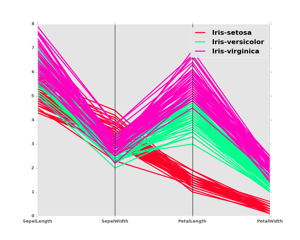
Parallel coordinates charts:
In [75]: plt.figure()
Out[75]: <matplotlib.figure.Figure at 0x2b35bbd50e50>

In [76]: parallel_coordinates(data, 'Name', colormap='gist_rainbow')
Out[76]: <matplotlib.axes._subplots.AxesSubplot at 0x2b35bbce9650>
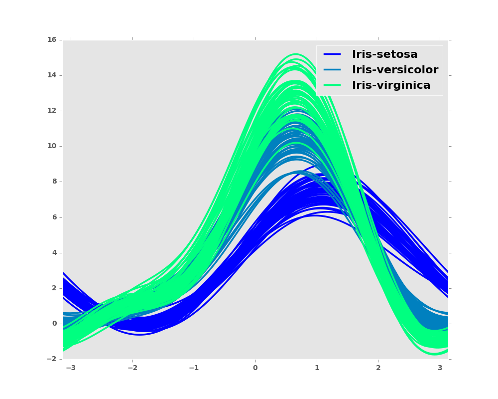
Andrews curves charts:
In [77]: plt.figure()
Out[77]: <matplotlib.figure.Figure at 0x2b35bde25410>

In [78]: andrews_curves(data, 'Name', colormap='winter')
Out[78]: <matplotlib.axes._subplots.AxesSubplot at 0x2b35bde25f90>