In [1]: import matplotlib as mpl

#mpl.rcParams['legend.fontsize']=20.0
#print mpl.matplotlib_fname() # location of the rc file
#print mpl.rcParams # current config
In [2]: print mpl.get_backend()
Qt5Agg
8.2 Other Plots
Plotting methods allow for a handful of plot styles other than the
default Line plot. These methods can be provided as the kind
keyword argument to plot().
These include:
- ‘bar’ or ‘barh’ for bar plots
- ‘hist’ for histogram
- ‘box’ for boxplot
- ‘kde’ or
'density'for density plots - ‘area’ for area plots
- ‘scatter’ for scatter plots
- ‘hexbin’ for hexagonal bin plots
- ‘pie’ for pie plots
For example, a bar plot can be created the following way:
In [3]: plt.figure();

In [4]: df.ix[5].plot(kind='bar'); plt.axhline(0, color='k')
Out[4]: <matplotlib.lines.Line2D at 0x2b358debd410>
New in version 0.17.0.
You can also create these other plots using the methods DataFrame.plot.<kind> instead of providing the kind keyword argument. This makes it easier to discover plot methods and the specific arguments they use:
In [5]: df = pd.DataFrame()

In [6]: df.plot.<TAB>
df.plot.area     df.plot.barh     df.plot.density  df.plot.hist     df.plot.line     df.plot.scatter
df.plot.bar      df.plot.box      df.plot.hexbin   df.plot.kde      df.plot.pie
In addition to these kind s, there are the DataFrame.hist(),
and DataFrame.boxplot() methods, which use a separate interface.
Finally, there are several plotting functions in pandas.tools.plotting
that take a Series or DataFrame as an argument. These
include
- Scatter Matrix
- Andrews Curves
- Parallel Coordinates
- Lag Plot
- Autocorrelation Plot
- Bootstrap Plot
- RadViz
Plots may also be adorned with errorbars or tables.
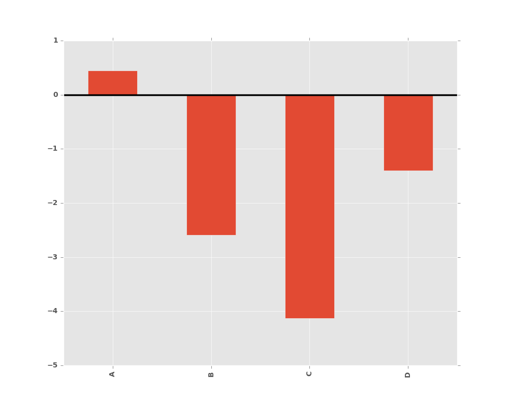
8.2.1 Bar plots
For labeled, non-time series data, you may wish to produce a bar plot:
In [7]: plt.figure();

In [8]: df.ix[5].plot.bar(); plt.axhline(0, color='k')
Out[8]: <matplotlib.lines.Line2D at 0x2b35ad0fe7d0>
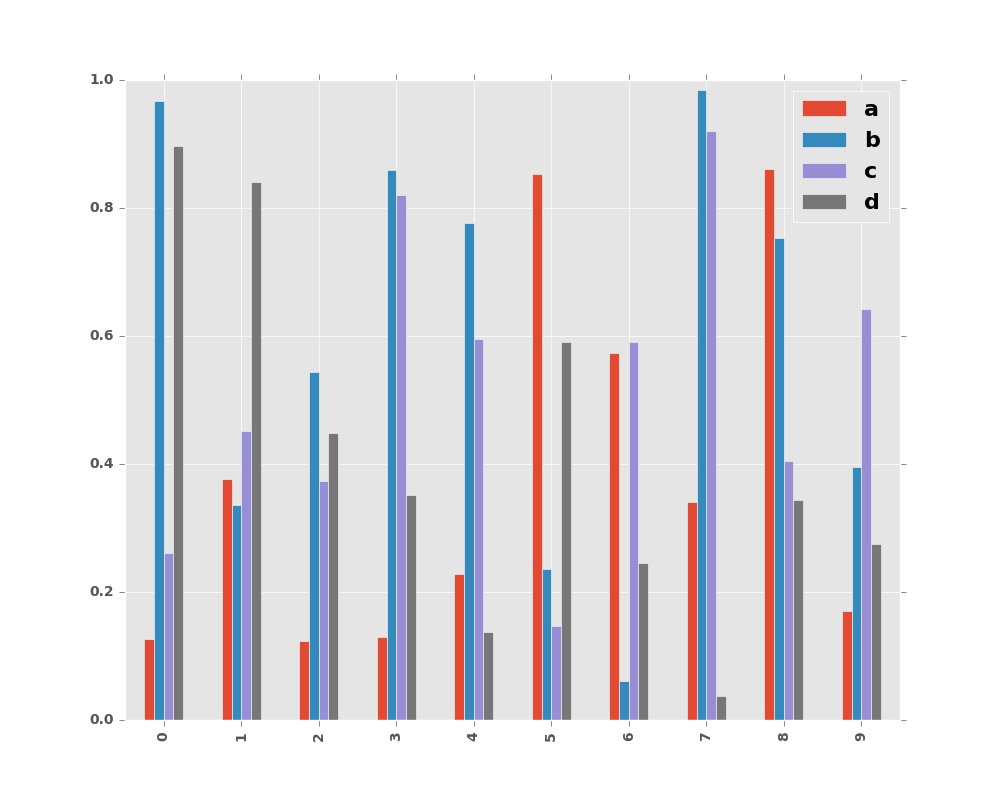
Calling a DataFrame’s plot.bar() method produces a multiple
bar plot:
In [9]: df2 = pd.DataFrame(np.random.rand(10, 4), columns=['a', 'b', 'c', 'd'])

In [10]: df2.plot.bar();
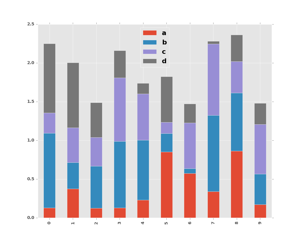
To produce a stacked bar plot, pass stacked=True:
In [11]: df2.plot.bar(stacked=True);
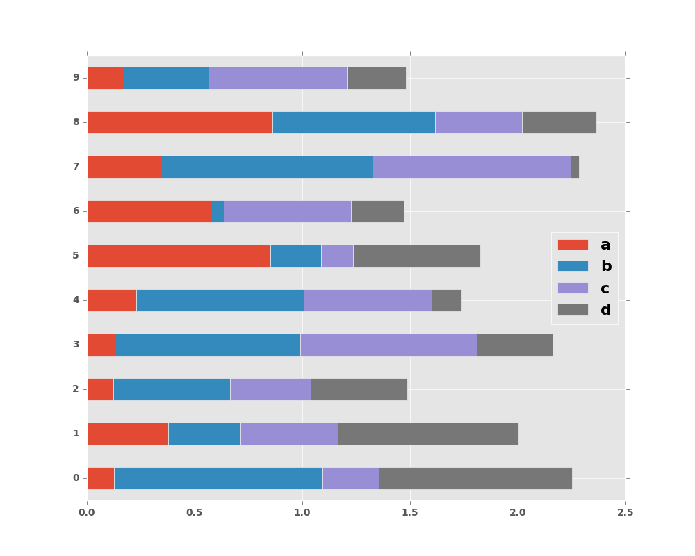
To get horizontal bar plots, use the barh method:
In [12]: df2.plot.barh(stacked=True);
8.2.2 Histograms
New in version 0.15.0.
Histogram can be drawn by using the DataFrame.plot.hist() and Series.plot.hist() methods.
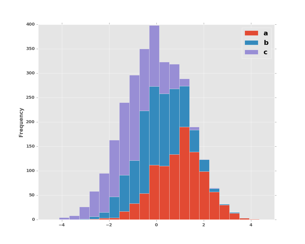
In [13]: df4 = pd.DataFrame({'a': np.random.randn(1000) + 1, 'b': np.random.randn(1000),
   ....:                     'c': np.random.randn(1000) - 1}, columns=['a', 'b', 'c'])
   ....:

In [14]: plt.figure();

In [15]: df4.plot.hist(alpha=0.5)
Out[15]: <matplotlib.axes._subplots.AxesSubplot at 0x2b35acc83e90>
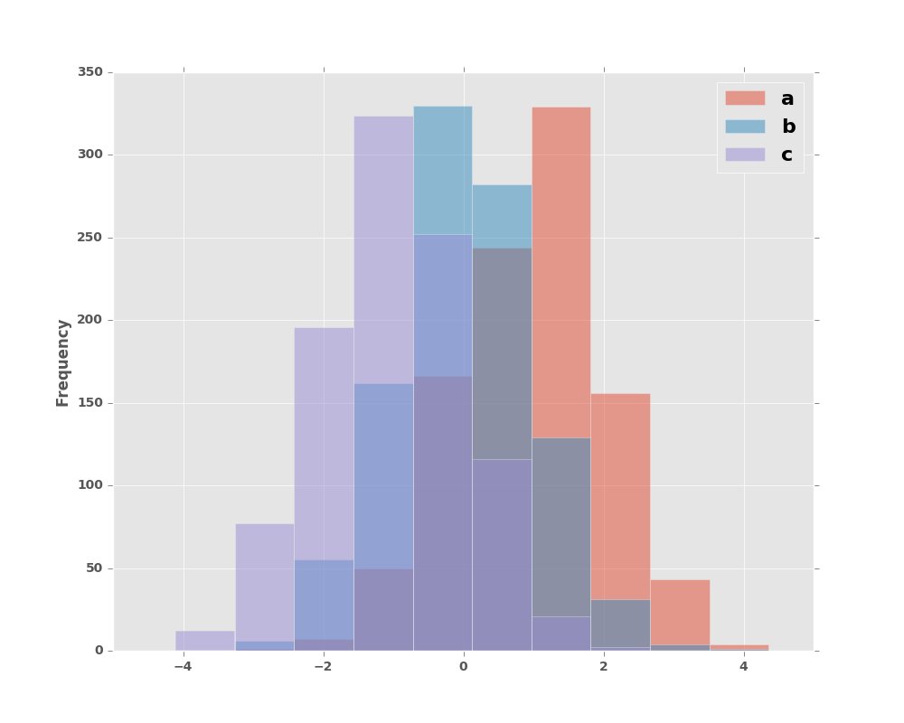
Histogram can be stacked by stacked=True. Bin size can be changed by bins keyword.
In [16]: plt.figure();

In [17]: df4.plot.hist(stacked=True, bins=20)
Out[17]: <matplotlib.axes._subplots.AxesSubplot at 0x2b35acfc8310>
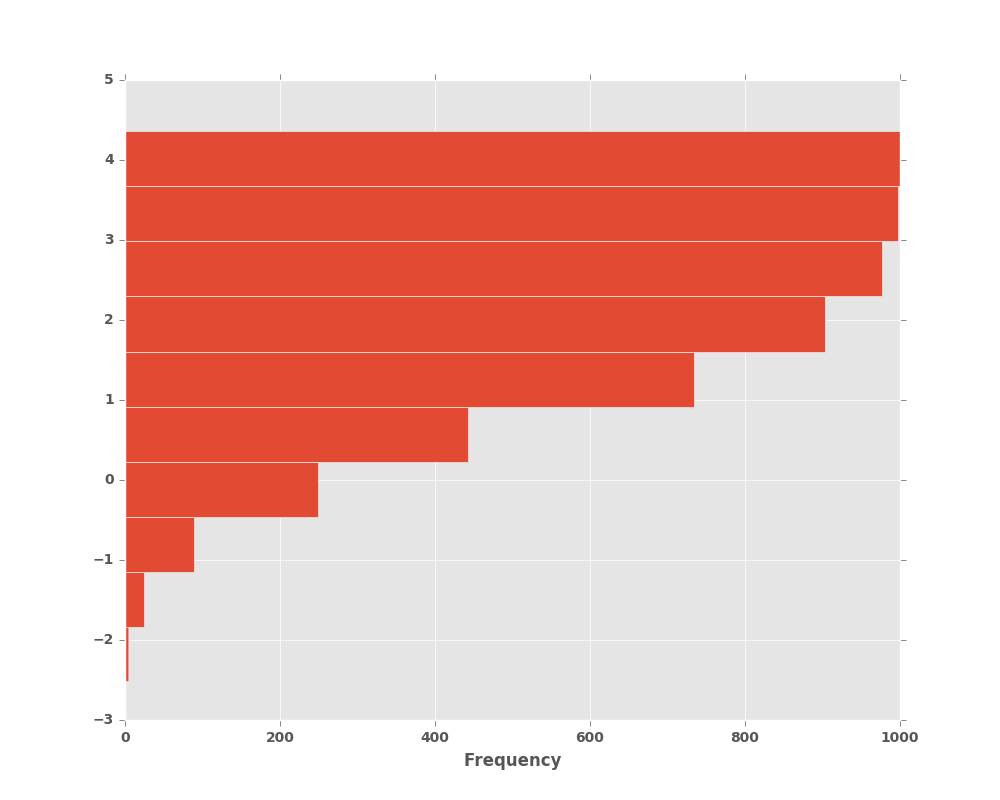
You can pass other keywords supported by matplotlib hist. For example, horizontal and cumulative histgram can be drawn by orientation='horizontal' and cumulative='True'.
In [18]: plt.figure();

In [19]: df4['a'].plot.hist(orientation='horizontal', cumulative=True)
Out[19]: <matplotlib.axes._subplots.AxesSubplot at 0x2b35bed7ab90>
See the hist method and the
matplotlib hist documentation for more.
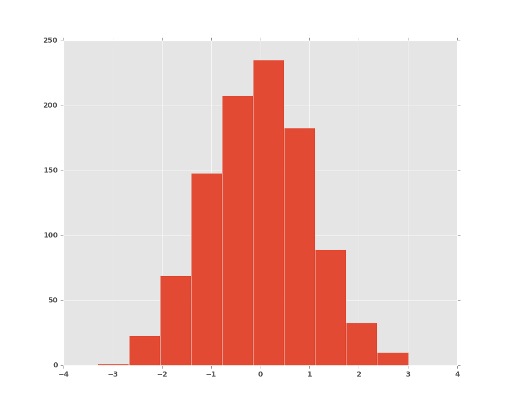
The existing interface DataFrame.hist to plot histogram still can be used.
In [20]: plt.figure();

In [21]: df['A'].diff().hist()
Out[21]: <matplotlib.axes._subplots.AxesSubplot at 0x2b35bec00850>
DataFrame.hist() plots the histograms of the columns on multiple
subplots:
In [22]: plt.figure()
Out[22]: <matplotlib.figure.Figure at 0x2b35bb993290>
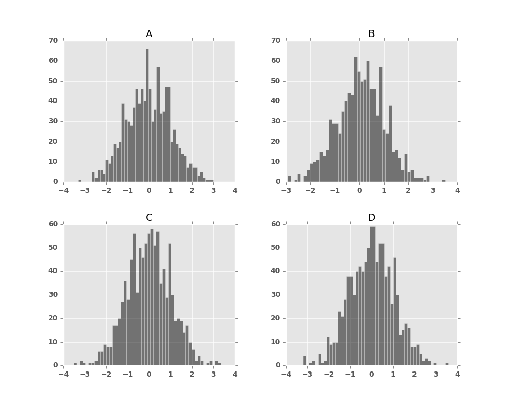
In [23]: df.diff().hist(color='k', alpha=0.5, bins=50)
Out[23]:
array([[<matplotlib.axes._subplots.AxesSubplot object at 0x2b35bb8ed290>,
<matplotlib.axes._subplots.AxesSubplot object at 0x2b35bba4c350>],
[<matplotlib.axes._subplots.AxesSubplot object at 0x2b35bbacb8d0>,
<matplotlib.axes._subplots.AxesSubplot object at 0x2b35bbb2de10>]], dtype=object)
New in version 0.10.0.
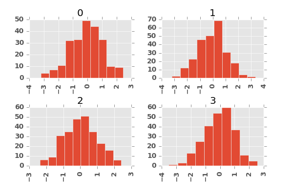
The by keyword can be specified to plot grouped histograms:
In [24]: data = pd.Series(np.random.randn(1000))

In [25]: data.hist(by=np.random.randint(0, 4, 1000), figsize=(6, 4))
Out[25]:
array([[<matplotlib.axes._subplots.AxesSubplot object at 0x2b35bbd832d0>,
        <matplotlib.axes._subplots.AxesSubplot object at 0x2b35bbee8d10>],
       [<matplotlib.axes._subplots.AxesSubplot object at 0x2b35bbf6bc90>,
        <matplotlib.axes._subplots.AxesSubplot object at 0x2b35bbfdb3d0>]], dtype=object)
8.2.3 Box Plots
New in version 0.15.0.
Boxplot can be drawn calling Series.plot.box() and DataFrame.plot.box(),
or DataFrame.boxplot() to visualize the distribution of values within each column.
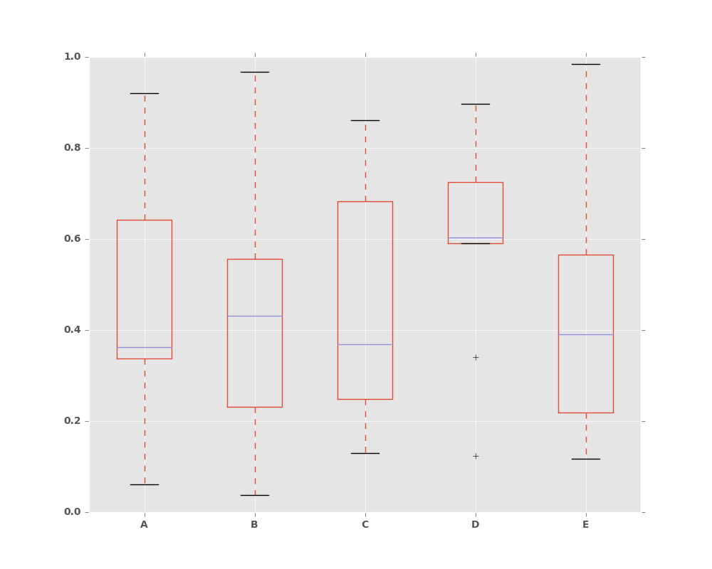
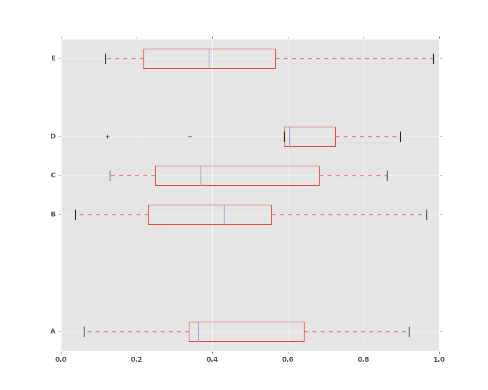
For instance, here is a boxplot representing five trials of 10 observations of a uniform random variable on [0,1).
In [26]: df = pd.DataFrame(np.random.rand(10, 5), columns=['A', 'B', 'C', 'D', 'E'])

In [27]: df.plot.box()
Out[27]: <matplotlib.axes._subplots.AxesSubplot at 0x2b35bc2563d0>
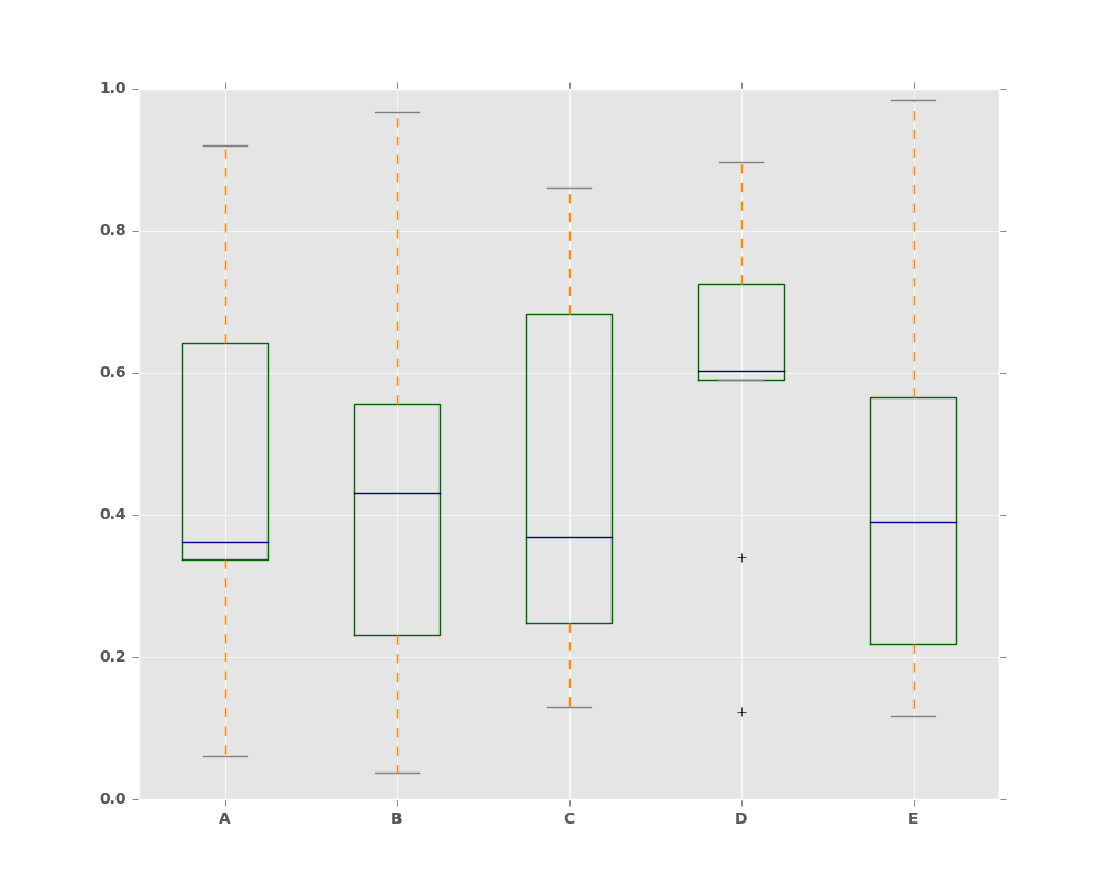
Boxplot can be colorized by passing color keyword. You can pass a dict
whose keys are boxes, whiskers, medians and caps.
If some keys are missing in the dict, default colors are used
for the corresponding artists. Also, boxplot has sym keyword to specify fliers style.
When you pass other type of arguments via color keyword, it will be directly
passed to matplotlib for all the boxes, whiskers, medians and caps
colorization.
The colors are applied to every boxes to be drawn. If you want more complicated colorization, you can get each drawn artists by passing return_type.
In [28]: color = dict(boxes='DarkGreen', whiskers='DarkOrange',
   ....:              medians='DarkBlue', caps='Gray')
   ....:

In [29]: df.plot.box(color=color, sym='r+')
Out[29]: <matplotlib.axes._subplots.AxesSubplot at 0x2b35bc278e90>
Also, you can pass other keywords supported by matplotlib boxplot.
For example, horizontal and custom-positioned boxplot can be drawn by
vert=False and positions keywords.
In [30]: df.plot.box(vert=False, positions=[1, 4, 5, 6, 8])
Out[30]: <matplotlib.axes._subplots.AxesSubplot at 0x2b35bc523290>
See the boxplot method and the
matplotlib boxplot documentation for more.
The existing interface DataFrame.boxplot to plot boxplot still can be used.
In [31]: df = pd.DataFrame(np.random.rand(10,5))

In [32]: plt.figure();

In [33]: bp = df.boxplot()

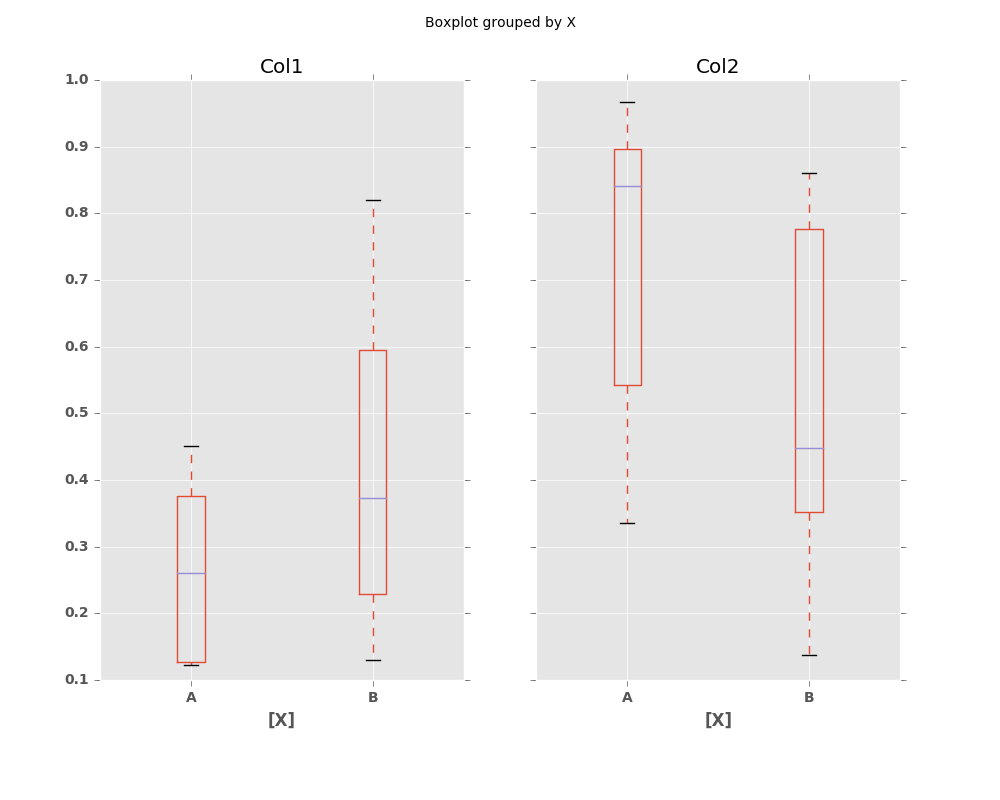
You can create a stratified boxplot using the by keyword argument to create
groupings. For instance,
In [34]: df = pd.DataFrame(np.random.rand(10,2), columns=['Col1', 'Col2'] )

In [35]: df['X'] = pd.Series(['A','A','A','A','A','B','B','B','B','B'])

In [36]: plt.figure();

In [37]: bp = df.boxplot(by='X')
You can also pass a subset of columns to plot, as well as group by multiple columns:
In [38]: df = pd.DataFrame(np.random.rand(10,3), columns=['Col1', 'Col2', 'Col3'])

In [39]: df['X'] = pd.Series(['A','A','A','A','A','B','B','B','B','B'])

In [40]: df['Y'] = pd.Series(['A','B','A','B','A','B','A','B','A','B'])

In [41]: plt.figure();

In [42]: bp = df.boxplot(column=['Col1','Col2'], by=['X','Y'])

Basically, plot functions return matplotlib Axes as a return value.
In boxplot, the return type can be changed by argument return_type, and whether the subplots is enabled (subplots=True in plot or by is specified in boxplot).
When subplots=False / by is None:
- if
return_typeis'dict', a dictionary containing thematplotlib Linesis returned. The keys are “boxes”, “caps”, “fliers”, “medians”, and “whiskers”. This is the default of
boxplotin historical reason. Note thatplot.box()returnsAxesby default same as other plots.
- if
if
return_typeis'axes', amatplotlib Axescontaining the boxplot is returned.- if
return_typeis'both'a namedtuple containing thematplotlib Axes and
matplotlib Linesis returned
- if
When subplots=True / by is some column of the DataFrame:
- A dict of
return_typeis returned, where the keys are the columns of the DataFrame. The plot has a facet for each column of the DataFrame, with a separate box for each value ofby.
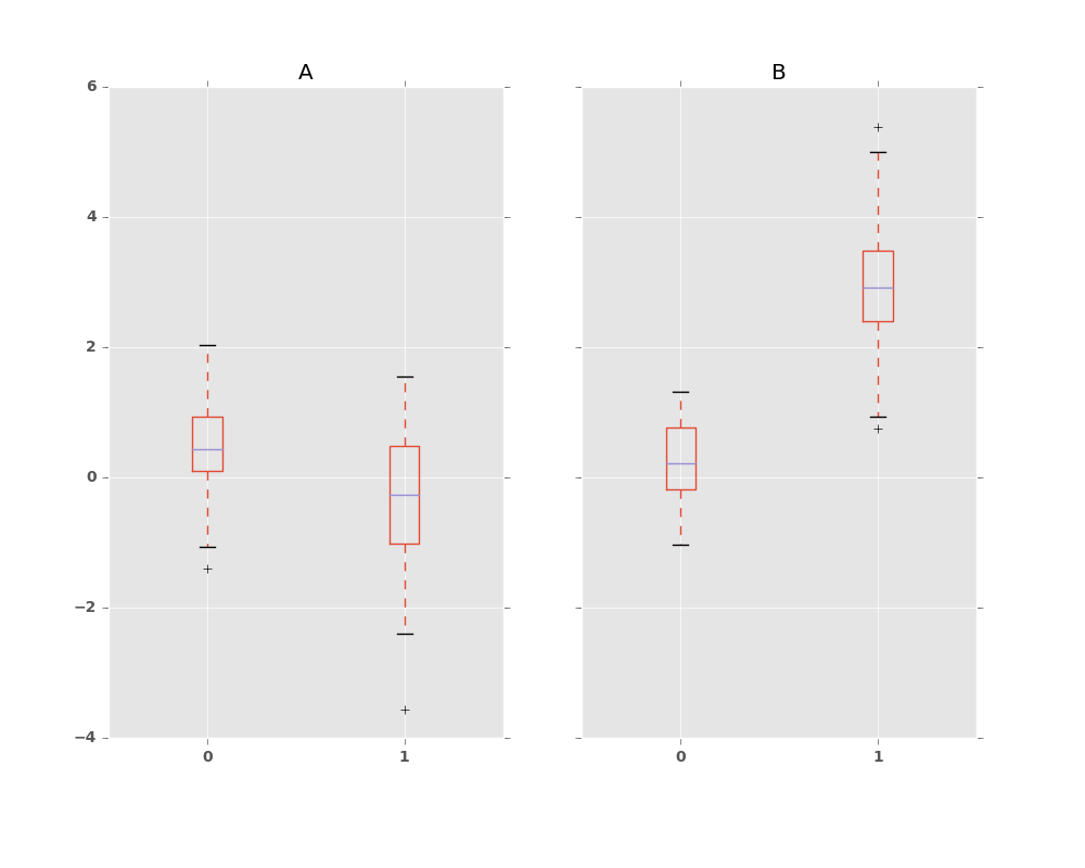
Finally, when calling boxplot on a Groupby object, a dict of return_type
is returned, where the keys are the same as the Groupby object. The plot has a
facet for each key, with each facet containing a box for each column of the
DataFrame.
In [43]: np.random.seed(1234)

In [44]: df_box = pd.DataFrame(np.random.randn(50, 2))

In [45]: df_box['g'] = np.random.choice(['A', 'B'], size=50)

In [46]: df_box.loc[df_box['g'] == 'B', 1] += 3

In [47]: bp = df_box.boxplot(by='g')
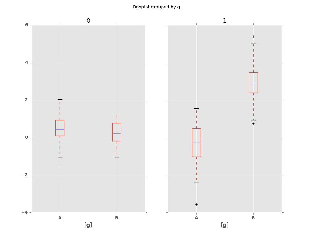
Compare to:
In [48]: bp = df_box.groupby('g').boxplot()
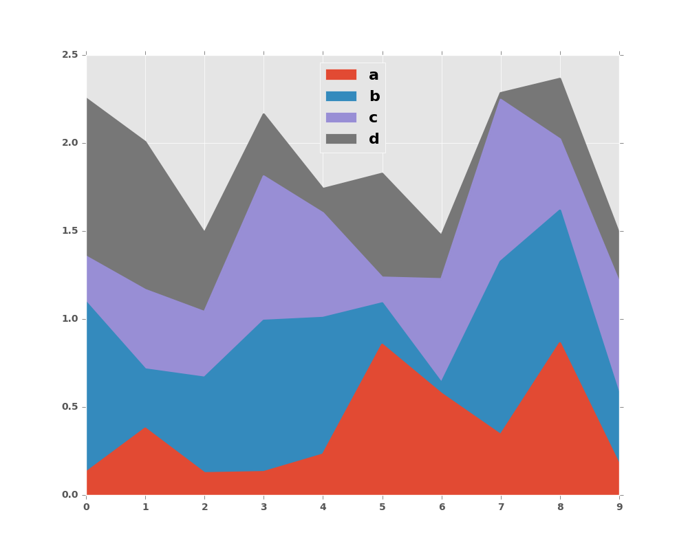
8.2.4 Area Plot
New in version 0.14.
You can create area plots with Series.plot.area() and DataFrame.plot.area().
Area plots are stacked by default. To produce stacked area plot, each column must be either all positive or all negative values.
When input data contains NaN, it will be automatically filled by 0. If you want to drop or fill by different values, use dataframe.dropna() or dataframe.fillna() before calling plot.
In [49]: df = pd.DataFrame(np.random.rand(10, 4), columns=['a', 'b', 'c', 'd'])

In [50]: df.plot.area();
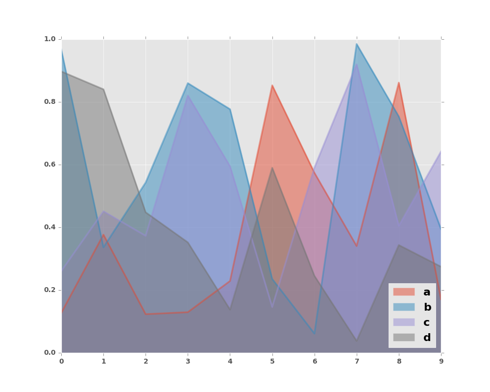
To produce an unstacked plot, pass stacked=False. Alpha value is set to 0.5 unless otherwise specified:
In [51]: df.plot.area(stacked=False);
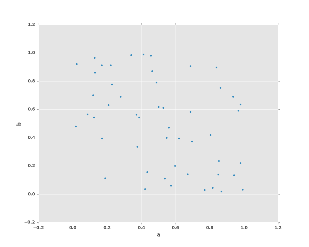
8.2.5 Scatter Plot
New in version 0.13.
Scatter plot can be drawn by using the DataFrame.plot.scatter() method.
Scatter plot requires numeric columns for x and y axis.
These can be specified by x and y keywords each.
In [52]: df = pd.DataFrame(np.random.rand(50, 4), columns=['a', 'b', 'c', 'd'])

In [53]: df.plot.scatter(x='a', y='b');
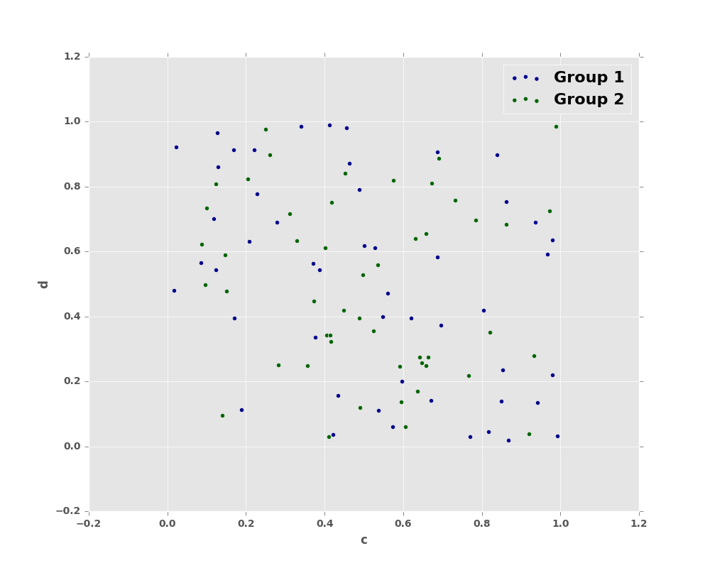
To plot multiple column groups in a single axes, repeat plot method specifying target ax.
It is recommended to specify color and label keywords to distinguish each groups.
In [54]: ax = df.plot.scatter(x='a', y='b', color='DarkBlue', label='Group 1');

In [55]: df.plot.scatter(x='c', y='d', color='DarkGreen', label='Group 2', ax=ax);
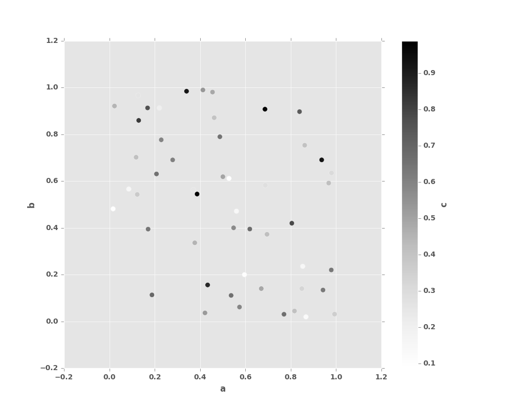
The keyword c may be given as the name of a column to provide colors for
each point:
In [56]: df.plot.scatter(x='a', y='b', c='c', s=50);
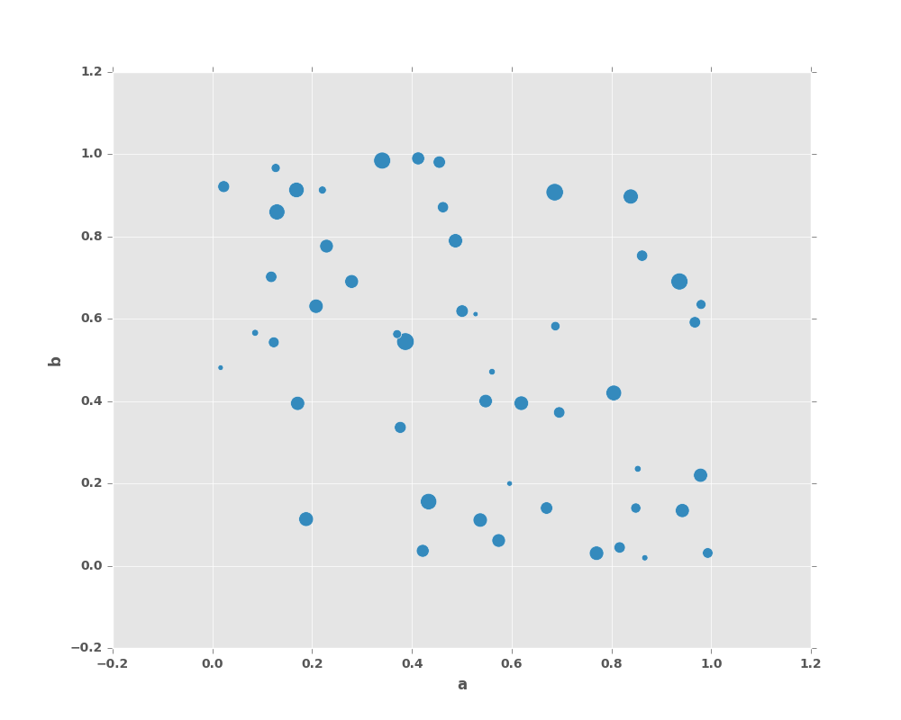
You can pass other keywords supported by matplotlib scatter.
Below example shows a bubble chart using a dataframe column values as bubble size.
In [57]: df.plot.scatter(x='a', y='b', s=df['c']*200);
See the scatter method and the
matplotlib scatter documentation for more.
8.2.6 Hexagonal Bin Plot
New in version 0.14.
You can create hexagonal bin plots with DataFrame.plot.hexbin().
Hexbin plots can be a useful alternative to scatter plots if your data are
too dense to plot each point individually.
In [58]: df = pd.DataFrame(np.random.randn(1000, 2), columns=['a', 'b'])

In [59]: df['b'] = df['b'] + np.arange(1000)

In [60]: df.plot.hexbin(x='a', y='b', gridsize=25)
Out[60]: <matplotlib.axes._subplots.AxesSubplot at 0x2b35bd4cdd90>
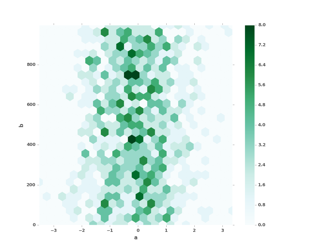
A useful keyword argument is gridsize; it controls the number of hexagons
in the x-direction, and defaults to 100. A larger gridsize means more, smaller
bins.
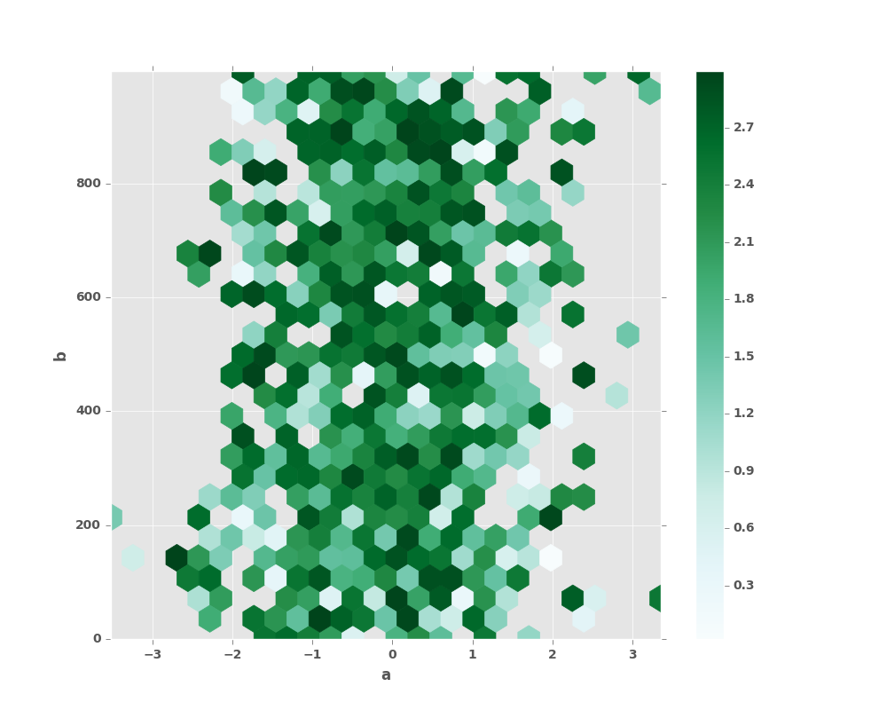
By default, a histogram of the counts around each (x, y) point is computed.
You can specify alternative aggregations by passing values to the C and
reduce_C_function arguments. C specifies the value at each (x, y) point
and reduce_C_function is a function of one argument that reduces all the
values in a bin to a single number (e.g. mean, max, sum, std). In this
example the positions are given by columns a and b, while the value is
given by column z. The bins are aggregated with numpy’s max function.
In [61]: df = pd.DataFrame(np.random.randn(1000, 2), columns=['a', 'b'])

In [62]: df['b'] = df['b'] = df['b'] + np.arange(1000)

In [63]: df['z'] = np.random.uniform(0, 3, 1000)

In [64]: df.plot.hexbin(x='a', y='b', C='z', reduce_C_function=np.max,
   ....:         gridsize=25)
   ....:
Out[64]: <matplotlib.axes._subplots.AxesSubplot at 0x2b35bd4cdf90>
See the hexbin method and the
matplotlib hexbin documentation for more.
8.2.7 Pie plot
New in version 0.14.
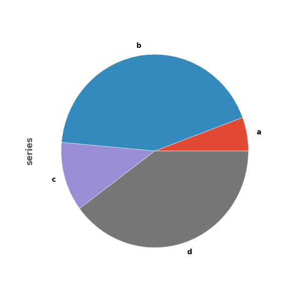
You can create a pie plot with DataFrame.plot.pie() or Series.plot.pie().
If your data includes any NaN, they will be automatically filled with 0.
A ValueError will be raised if there are any negative values in your data.
In [65]: series = pd.Series(3 * np.random.rand(4), index=['a', 'b', 'c', 'd'], name='series')

In [66]: series.plot.pie(figsize=(6, 6))
Out[66]: <matplotlib.axes._subplots.AxesSubplot at 0x2b35bd454c90>
For pie plots it’s best to use square figures, one’s with an equal aspect ratio. You can create the
figure with equal width and height, or force the aspect ratio to be equal after plotting by
calling ax.set_aspect('equal') on the returned axes object.
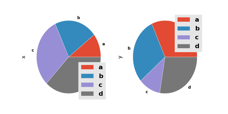
Note that pie plot with DataFrame requires that you either specify a target column by the y
argument or subplots=True. When y is specified, pie plot of selected column
will be drawn. If subplots=True is specified, pie plots for each column are drawn as subplots.
A legend will be drawn in each pie plots by default; specify legend=False to hide it.
In [67]: df = pd.DataFrame(3 * np.random.rand(4, 2), index=['a', 'b', 'c', 'd'], columns=['x', 'y'])

In [68]: df.plot.pie(subplots=True, figsize=(8, 4))
Out[68]:
array([<matplotlib.axes._subplots.AxesSubplot object at 0x2b35bd172690>,
       <matplotlib.axes._subplots.AxesSubplot object at 0x2b35bd00a510>], dtype=object)
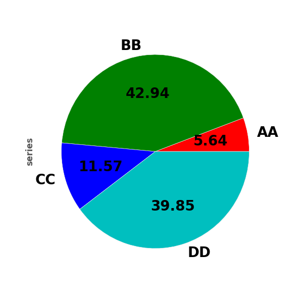
You can use the labels and colors keywords to specify the labels and colors of each wedge.
Warning
Most pandas plots use the the label and color arguments (note the lack of “s” on those).
To be consistent with matplotlib.pyplot.pie() you must use labels and colors.
If you want to hide wedge labels, specify labels=None.
If fontsize is specified, the value will be applied to wedge labels.
Also, other keywords supported by matplotlib.pyplot.pie() can be used.
In [69]: series.plot.pie(labels=['AA', 'BB', 'CC', 'DD'], colors=['r', 'g', 'b', 'c'],
   ....:                 autopct='%.2f', fontsize=20, figsize=(6, 6))
   ....:
Out[69]: <matplotlib.axes._subplots.AxesSubplot at 0x2b35bcd053d0>
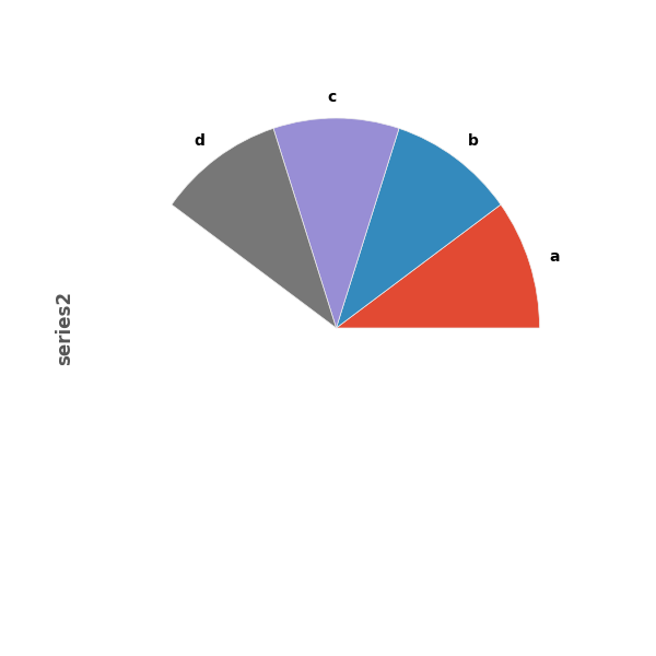
If you pass values whose sum total is less than 1.0, matplotlib draws a semicircle.
In [70]: series = pd.Series([0.1] * 4, index=['a', 'b', 'c', 'd'], name='series2')

In [71]: series.plot.pie(figsize=(6, 6))
Out[71]: <matplotlib.axes._subplots.AxesSubplot at 0x2b35bcd65e90>
See the matplotlib pie documentation for more.